Neutral kitchens are often misunderstood.
They’re not colorless. They’re intentional.
When designed well, neutral palettes create depth, calm, and longevity. When designed poorly, they feel flat, sterile, or disconnected.
The difference lies in balance.
In 2026 and beyond, the most successful kitchens are built on the careful interplay between warm and cool tones—creating spaces that feel grounded, bright, and emotionally comfortable at the same time.
Understanding the Role of Temperature in Color Design
Every color carries temperature.
Some tones feel warm and grounding. Others feel cool and expansive. A balanced kitchen uses both.
Warm tones provide comfort and approachability. Cool tones provide clarity and lightness. Together, they create visual equilibrium.
Without this balance, neutral spaces drift toward either heaviness or coldness.
Building a Balanced Neutral Foundation
Strong kitchens begin with stable base materials.
These foundational surfaces determine how warmth and coolness interact throughout the space.
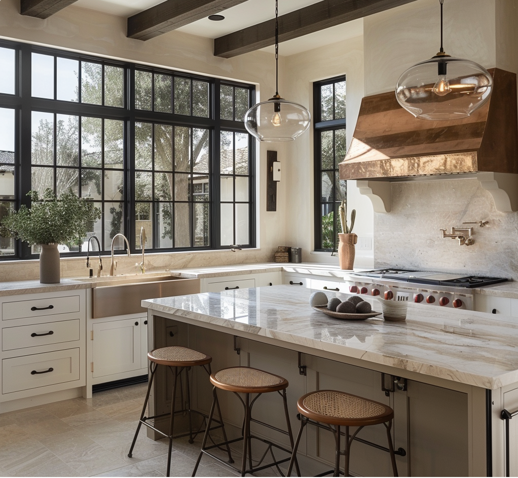
Selecting Countertops With Subtle Temperature Control
Countertops often serve as the primary visual anchor.
Popular balanced options include:
- Soft white quartz with warm veining
- Light gray stone with beige undertones
- Cream-toned composites
- Muted marble-inspired surfaces
These materials reflect light while retaining softness. They prevent kitchens from feeling clinical.
Balance starts at the work surface.
Choosing Cabinet Finishes That Anchor the Space
Cabinetry carries emotional weight.
Warm wood tones, creamy whites, and soft taupes introduce comfort. Cooler grays and pale charcoals add structure and definition.
Effective kitchens often pair:
- Warm lower cabinetry with cooler uppers
- Natural wood islands with neutral perimeters
- Cream finishes with gray-based accents
This layering creates visual stability.
Using Materials to Regulate Visual Temperature
Color alone does not determine warmth.
Texture and material matter just as much.
Integrating Natural Elements
Wood, stone, leathered finishes, and textured metals naturally warm neutral spaces.
These materials counterbalance cool surfaces such as polished quartz, porcelain, and glass.
Nature restores equilibrium.
Incorporating Soft Metals and Hardware
Hardware acts as visual punctuation.
Brushed brass, champagne bronze, and warm nickel add subtle warmth. Matte black and stainless steel introduce contrast and structure.
Balanced kitchens often blend both.
Metal becomes a temperature mediator.
Lighting as the Hidden Balancing Tool
Lighting determines how colors are perceived.
The same kitchen can feel warm or cold depending on illumination.
Layering Light Sources
Successful kitchens combine:
- Natural daylight
- Ambient ceiling lighting
- Task lighting
- Accent lighting
This prevents harsh contrasts and supports consistent tone throughout the day.
Selecting Appropriate Color Temperatures
Light bulbs matter.
Warm-white lighting softens cool surfaces. Neutral-white lighting preserves clarity without harshness.
Overly cool lighting can undermine even the best material selections.
Light completes color.
Designing Zones With Intentional Temperature Shifts
Modern kitchens are not uniform environments.
Different zones support different activities.
Warming Social and Gathering Areas
Islands, breakfast nooks, and seating areas benefit from warmer tones and materials. These zones invite lingering and conversation.
Comfort encourages connection.
Cooling Work and Prep Areas
Prep zones often perform best with cooler surfaces that reflect light and emphasize cleanliness and precision.
Coolness supports focus.
Balance supports flow.
Avoiding Common Neutral Design Pitfalls
Many neutral kitchens fail for predictable reasons.
Common mistakes include:
- Using only cool grays
- Overusing bright white
- Ignoring undertones
- Mixing incompatible neutrals
- Neglecting texture
These choices flatten spaces and accelerate design fatigue.
Restraint prevents regret.
Designing for Longevity and Adaptability
Balanced neutral kitchens age well.
They allow homeowners to refresh spaces through:
- New hardware
- Updated lighting
- Seasonal décor
- Textile changes
- Furniture swaps
The foundation remains relevant.
Flexibility is built in.
Emotional Impact of Balanced Neutrals
Well-balanced kitchens influence behavior.
They feel:
- Calm without being dull
- Bright without being harsh
- Refined without being cold
- Inviting without being busy
People stay longer. Spaces feel settled. Homes feel complete.
Design affects nervous systems. Not just aesthetics.
Our Approach at Drapers Homes
At Drapers Homes, we design neutral kitchens as layered systems.
We evaluate natural light, material undertones, cabinetry finishes, hardware, and lighting temperatures before finalizing palettes. Our goal is to create kitchens that feel balanced in every season and every phase of life.
We do not choose colors in isolation. We design relationships between materials.
If you are planning a kitchen renovation or custom home in Utah, we are here to help you create a neutral palette that supports comfort, clarity, and long-term beauty.
Because harmony is not accidental. It’s designed.